
Harnessing the Power of Personalized Wellness
Day-J is an innovative iOS wellness app that helps users achieve a healthier lifestyle by connecting them with health professionals, personalized content and AI powered recommendations. The client partnered with Xmartlabs to achieve their desired outcomes.
Services
Product Discovery
UX/UI design
QA
Mobile Development
Engagement
1 year
Platform
React Native
Typescript

About Day-J
Day-J is a wellness app for iOS that enhances users’ overall health and well-being by tracking their habits and providing personalized recommendations and guidance from licensed professionals and proprietary AI technology. The app has four main pillars:
• Track, which allows users to track their food intake, sleep, exercise, and water consumption.
• Connect, which connects users with health professionals for a more customized plan and recommendations.
• Learn, which offers updated and personalized content, including video series and curated articles.
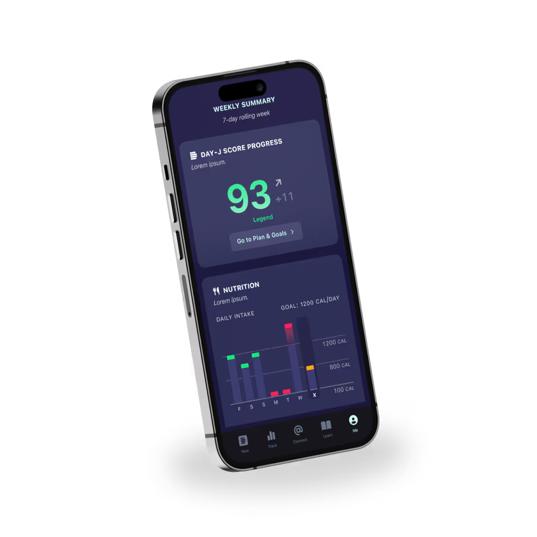
• Me, which provides users with an individual profile that shows their progress and stats through data visualization.
The client approached us with the objective of overhauling their existing app, which required a complete redesign of all screens and color schemes. Additionally, there was a need to enhance the performance and stability of the application, which was built using React Native and primarily targeted iOS users. The ultimate goal was to create a robust and well-received product that would generate sufficient user engagement, enabling the development of additional features.

The Challenge
The client had previously encountered some difficulties on their app project caused by limited in-house engineering resources and some key skills gaps in design and UX. Despite a substantial investment of time and resources, they where still to achieve the level of advancement they desired for their product.
Day-J came to us with an unfinished app and a tight deadline for completion. They needed a team that could work efficiently and deliver results quickly. The challenge was to finish the app and get it ready for launch within a constrained timeframe.
The Solution
We worked closely with the client to understand their needs and priorities, and we developed a plan to tackle the project in the most effective way possible. We knew that the key to success was clear communication and collaboration, so we made sure to keep the client in the loop every step of the way.


The Development Stage
We improved the code's quality and performance of the existing React Native app, prioritizing the iOS performance. We achieved a common vision and understood the client's needs while making insightful and valuable suggestions. We understood requirements, validated ideas, and translated them into the app. The back and forth with the client proved to be not only essential but very efficient.
One of the main challenges we faced was with the 'learn' dashboard that offered tailored content for each user. The backend couldn't support a recommendation engine or a search bar, so we had to perform a thorough process of content categorization to make it as easy as possible for users to find the right content.
The Design Stage
We re-designed the app with a more cohesive style, created a new design system, and suggested keeping the institutional branding as an umbrella brand so it would not go to waste. The look and feel of the app had been created during the previous development process but deferred with the branding that an agency had done for the company.
As part of this process, we conducted a benchmarking analysis to identify opportunities for improving the app's visual impact. We also placed a strong emphasis on the user experience, seeking out ways that design could increase value for them.
One major suggestion we made was to revamp the user profile to include more visual representations of goals and status, such as graphs and charts. This would allow users to quickly see visualize their health progress and habits and understand how they impacted their overall well-being.
Another significant challenge was creating a scalable design system for the app by making reusable and composable components. This required a significant amount of time and effort but ultimately proved to be an efficient solution that will save time in the future and facilitate changes and updates.

Results
Within a constrained timeframe, our team was able to deliver exceptional results that exceeded the client's expectations. By utilizing a highly efficient and agile approach, we were able to complete Scrum iterations that typically take two weeks in just one week, resulting in a high-quality final product. The app featured multiple functionalities and received overwhelmingly positive feedback from users. Our team successfully delivered an app that met the client's requirements and exceeded the expectations of end-users.
Xmartlabs developed an app that features a comprehensive suite of functionalities aimed at enhancing the health and wellness of users. These include an individualized profile design with data visualization capabilities, the ability to track eating, exercise, and sleep habits, a centralized dashboard for categorizing and organizing information, integration with Apple watch devices, and a barcode scanner for logging food and tracking calories and nutritional intake. Together, these features provide users with a comprehensive toolset for achieving and maintaining optimal health and wellness.


